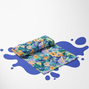
You already know how to create seamless patterns, but you lack ideas and inspiration for them? You do not know what colour palette will make your graphics stand out from the others? The colour wheel is an extremely helpful tool when creating your own graphics that are to be eye-catching. Of course, the tool itself will not make your work look great – you also need colour theory for that. Once you learn how to create unusual, but great-looking colour combinations, your graphics will take on a unique look.
Table of Content
- Colour wheel and how to use it
- How are the colours in the colour wheel divided?
- How to choose a colour palette?
Colour wheel and how to use it
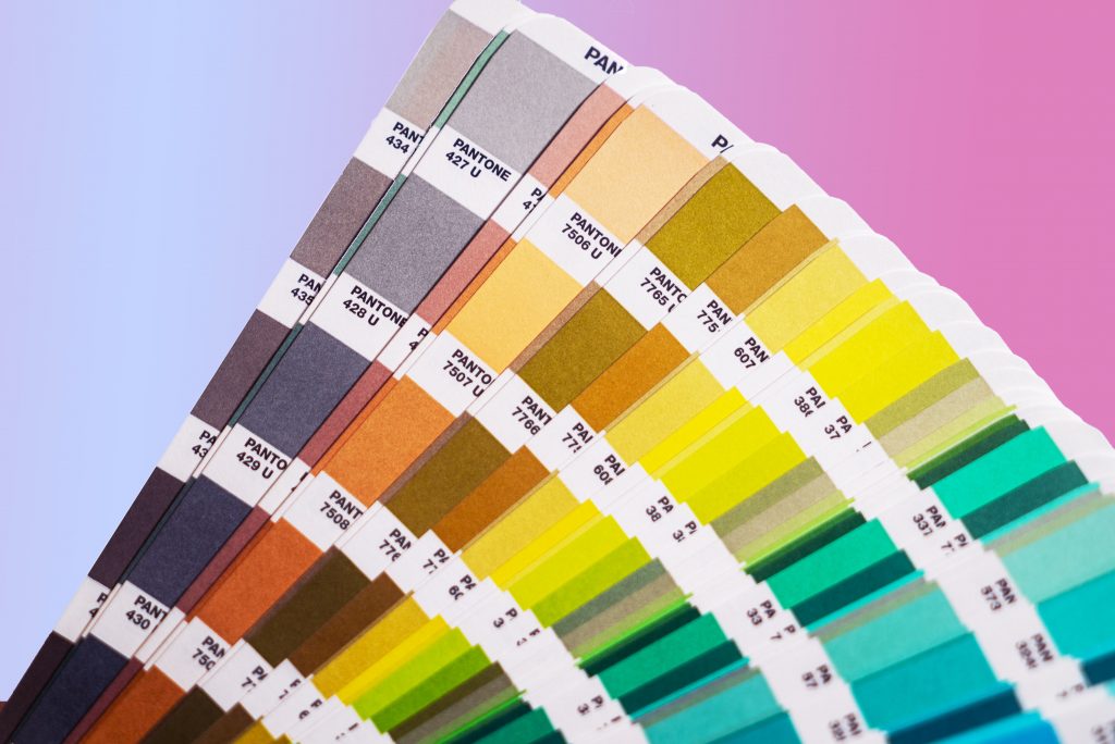
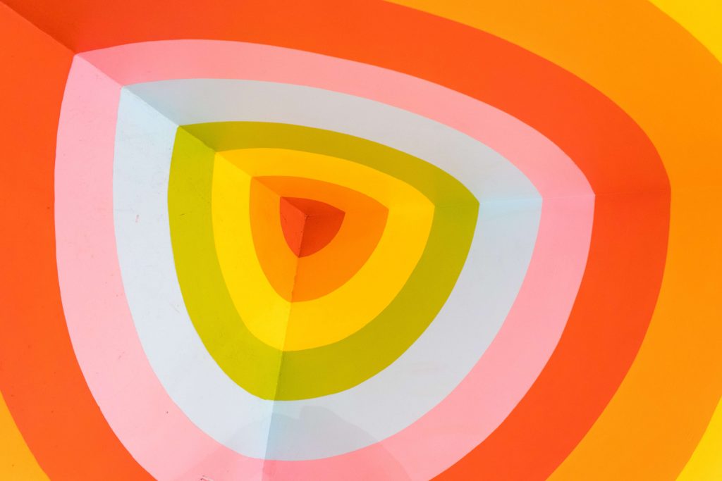
Although the sense of aesthetics is a very individual matter, there are several principles in art, the knowledge of which makes it much easier to create coherent compositions that will be interesting and pleasing to the eye even for the most layman and amateurs. The colour wheel created by the German physiologist Ewald Hering can help in understanding the colours and how they interact with each other. Four colours and their shades are distributed on the plan of a circle. More complex colour wheel schemes are divided into 12 sections, in which we can find not only the primary colours but also other shades and derivative colours that we can create by mixing the primary colours with each other in certain proportions.
How are the colours in the colour wheel divided?
Everyone probably remembers the lesson about colours from elementary school. Primary colours are usually defined first in art lessons. The basic colours are three colours: yellow, blue and red, from which you can create any other colour in the range of colours. By mixing the primary colours with each other, you create derivative colours. Sometimes green is also included in the primary colours, although this can be obtained from a combination of yellow and blue. In the visual arts, working with primary colours is not the easiest thing to do – it is very easy to use these colours to get a kitschy effect straight from the artwork of a preschooler.
On the colour wheel divided into more sectors, we can find analogous colours. Analogous colours are those that are located right next to each other on the colour wheel and arise within the same colour family, i.e. green and its shades, yellow and its shades, etc. Harmonious colours may appear in pairs, but a group of three or more analogous colours can be easily designated on the wheel. By using analogous colours, you can create a coherent and, at the same time, varied visual effect.
Speaking of consistency, nothing will give it as much in graphic work as monochrome colours. To find them, all you have to do is reach for the colours along the radius of the circle on the colour wheel. The monochrome palette will allow you to create a stylish and subdued work, so if you are just starting to create your own patterns and graphics, you can start with it to be sure that the composition will be beautifully presented.

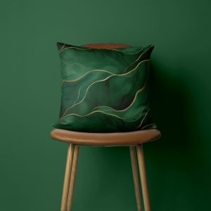
Complementary colours are pairs of colours that lie on opposite sides of the colour wheel. These are, for example, combinations of red and green or purple and yellow. This way you will introduce contrast to your graphics, but the colours will not clash with each other. The use of complementary colours can completely change the graphic work, as long as we use them skillfully and in moderation. In seamless patterns, you can try adding a complementary colour accent to a single-colour pattern. This way, your work becomes visually more interesting and attracts the human eye faster.
However, if you want to introduce more colours to your pattern or graphics that will harmonize with each other, you can decide to use a colour triad in your work. To find the triad on the colour wheel, select colours that are equidistant on the wheel. The triad of colours are colours that harmonize perfectly with each other, enrich the work, but do not introduce a contrast.
How to choose a colour palette?
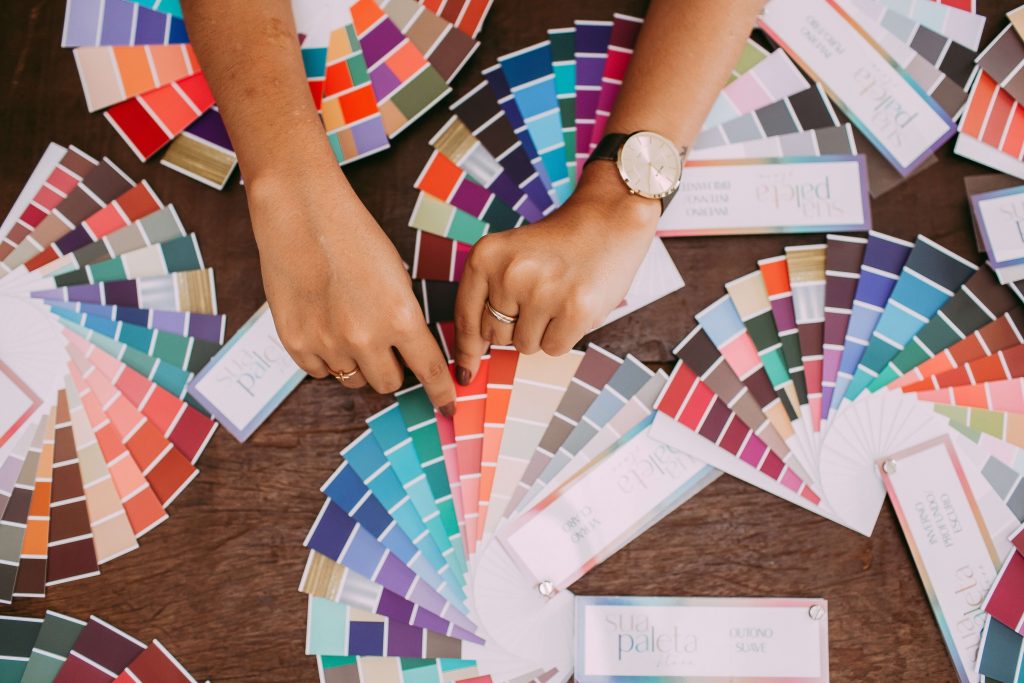
Do you have the impression that the colour theory is still complicated for you and you do not feel confident choosing a colour in your work? Start with simple colour combinations, i.e. monochrome or similar palettes. See how the individual shades of colour interact with each other and what effects can be obtained thanks to them. A limited colour palette will make it much easier for you to create a graphic design. To create a colour palette, you can use the tools available online or the palettes available in graphics programs. Of course, you can also buy a colour wheel in physical form and use it when working with graphics. Experiment with different colour combinations and see which ones you like best.
If you plan to print your patterns on materials, remember to save the finished graphics in the appropriate format and colour profile. Graphics in the RGB palette will look different than those prepared in the CMYK profile. It is best to design projects intended for printing in the CMYK colour palette and choose specific colours from there.