How do colour theory and a colour wheel help in creating stunning seamless patterns?
Colour theory in pattern design is a set of principles used to combine hues effectively to create harmonious and legible compositions. The central tool in this process is the colour wheel, which allows designers to choose colours for patterns in a precise and repeatable way. Thanks to it, professional color pattern design becomes a repeatable process rather than a matter of chance, which facilitates informed and predictable design decisions.
The colour wheel and how to use it
While aesthetics can be subjective, professional design relies on several established rules to create cohesive compositions.
The colour wheel, originally developed by physiologist Ewald Hering, is the primary tool for understanding how different tones interact. This knowledge is essential for grasping the differences between how colours appear on a screen and how they translate when printing on fabrics.
Colour theory as a practical design manual
Through the colour wheel, colour theory in pattern design stops being an abstract concept and becomes a practical manual. It allows designers to manage the viewer’s emotions and perceptions through calculated colour choices.
Using the wheel helps avoid randomness and builds a professional brand image. This expertise is vital for anyone aiming to create seamless patterns that are both aesthetically pleasing and technically sound.
Advanced colour wheel structures
Professional colour wheels are typically divided into 12 precise sections. These include primary, secondary, and tertiary colours, created by mixing base hues in specific proportions to achieve smooth tonal transitions.
Understanding this geometry makes it easier to find colours that harmonise or provide the necessary contrast. This is a crucial step when planning complex colour combinations in pattern design for commercial use.
Why the colour wheel matters for B2B
In professional projects, visual consistency is the foundation of trust. By using a colour wheel, a designer can guarantee that a chosen colour palette will perform equally well in digital formats and on printed materials.
A precise wheel division also simplifies communication with B2B clients. Instead of using subjective terms, designers can point to technical relationships like complementary colours or analogous colours, making the design process transparent and professional.
Common colour schemes used in pattern design
Most of us remember our first art lessons and the definition of primary colors: yellow, blue, and red. From the point of view of color physics, it is from these colors that almost every other color in the available range can be created.
In professional graphic design, however, the matter is more complex. By mixing primary colors, we obtain secondary colors. Their skillful combination is the basis on which every effective color theory in design is based.
The Pitfalls of a Primary Palette
Limiting yourself strictly to primary colors is a bold move that often presents a major hurdle. Without a keen eye for composition, the results can quickly veer into “kitschy” territory, echoing the look of simple arts and crafts.
To counter this, contemporary design leverages a sophisticated understanding of color wheel dynamics. This ensures that the final visuals are not only clear and original but also deeply integrated with the brand’s overall identity.
Monochromatic colour scheme – when to use it
A monochromatic palette is the go-to choice for modern minimalism and high-end elegance. It works best when you want to emphasize brand prestige and stability through a clean, sophisticated look using various shades of a single pigment.
Analogous colour scheme – when it works best
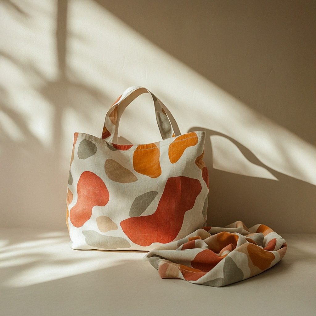
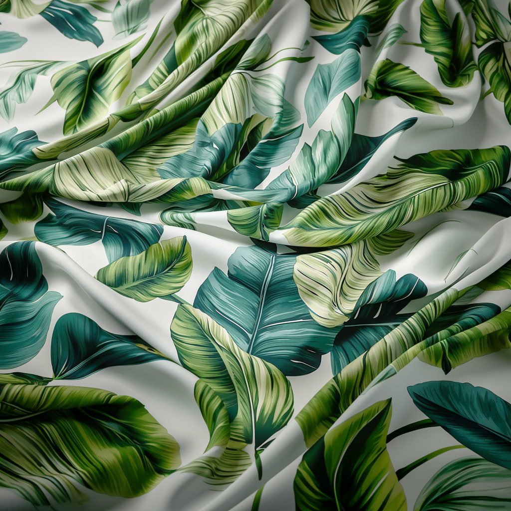
Analogous colours are those sitting next to each other on the wheel, such as various greens and blues. This scheme works best for creating serene, nature-inspired patterns that require visual depth without the risk of clashing elements.
Complementary colours – how to use contrast safely
Complementary colours sit opposite each other on the wheel and provide maximum visual impact. To use this contrast safely, apply the bolder hue as an accent against a more neutral base to make specific pattern elements pop.
Colour triad – balanced variety without chaos
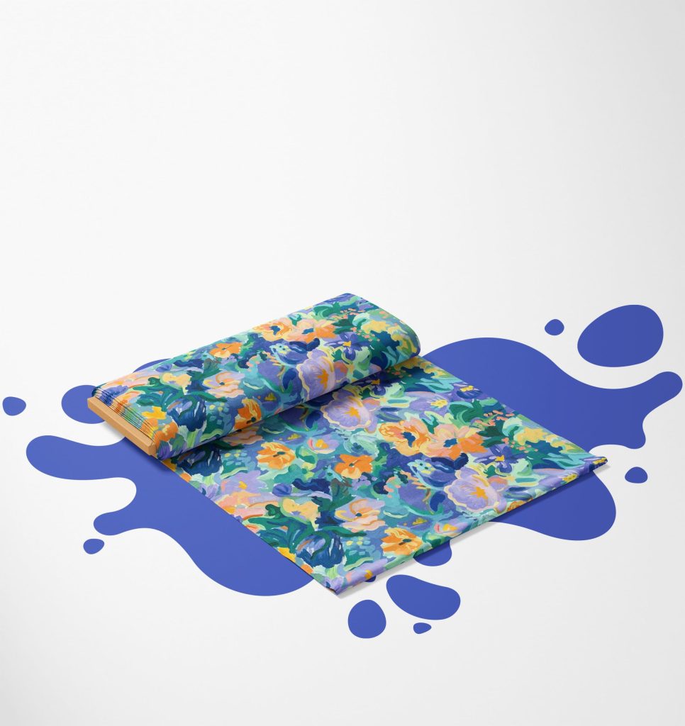
A colour triad uses three colours equidistant on the wheel to create a vibrant yet balanced colour palette. It is perfect for energetic, multi-dimensional designs where you want variety and “life” without losing the overall harmony of the pattern.
Choosing a colour palette for your project
If colour theory in pattern design still feels complex, start with simple combinations. Focusing on monochromatic or analogous schemes allows you to get comfortable with how different shades interact before moving to more advanced colour schemes.
A limited colour palette is often the secret to a successful professional project. Selecting two or three dominant tones ensures the pattern remains legible and the final print result is predictable.
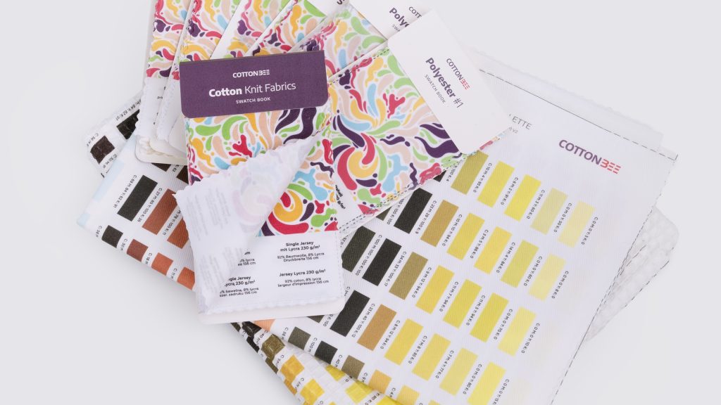
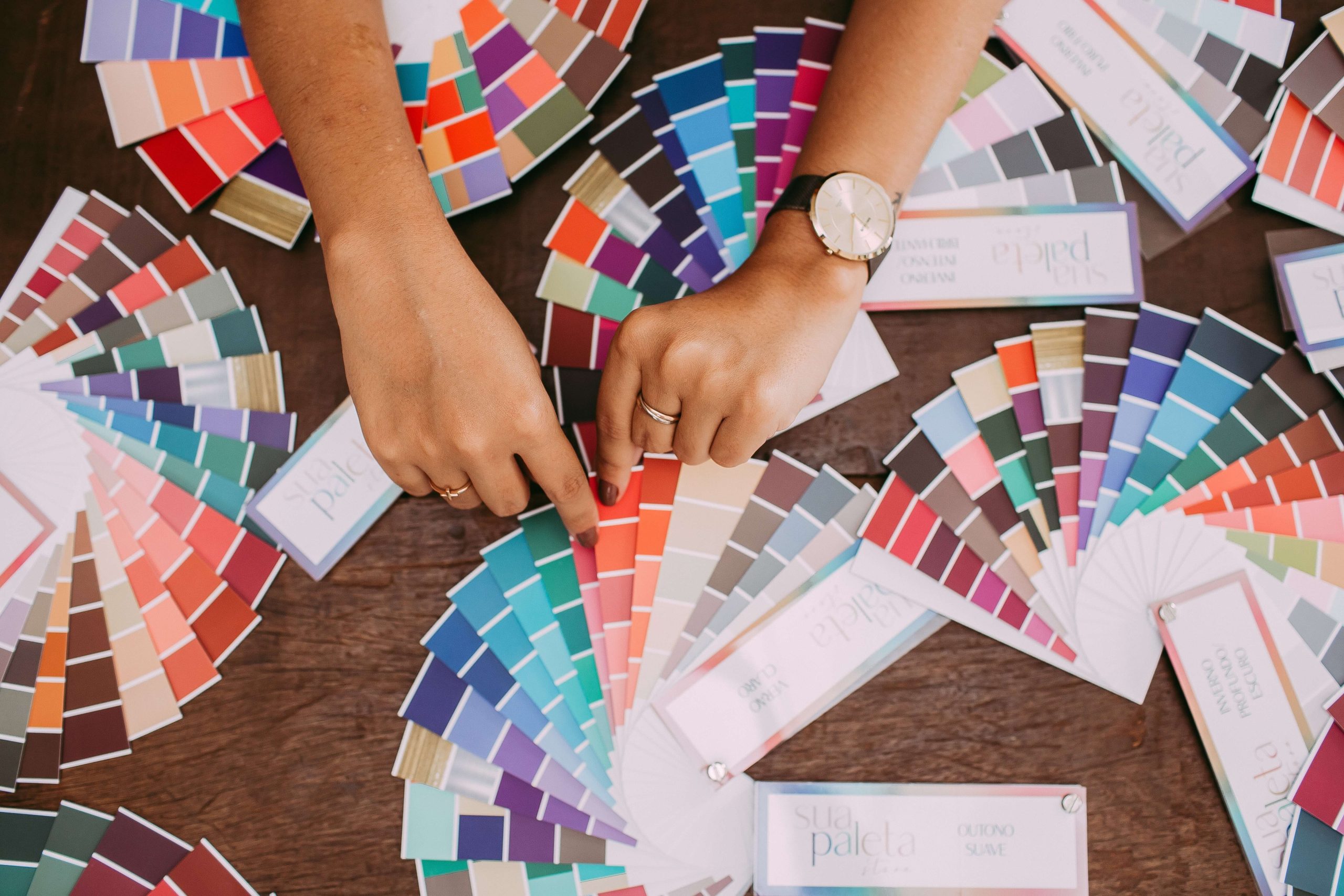
Tools for choosing colours for patterns
Modern designers don’t have to rely solely on intuition. Online tools can automatically generate technically correct colour schemes based on mathematical relationships.
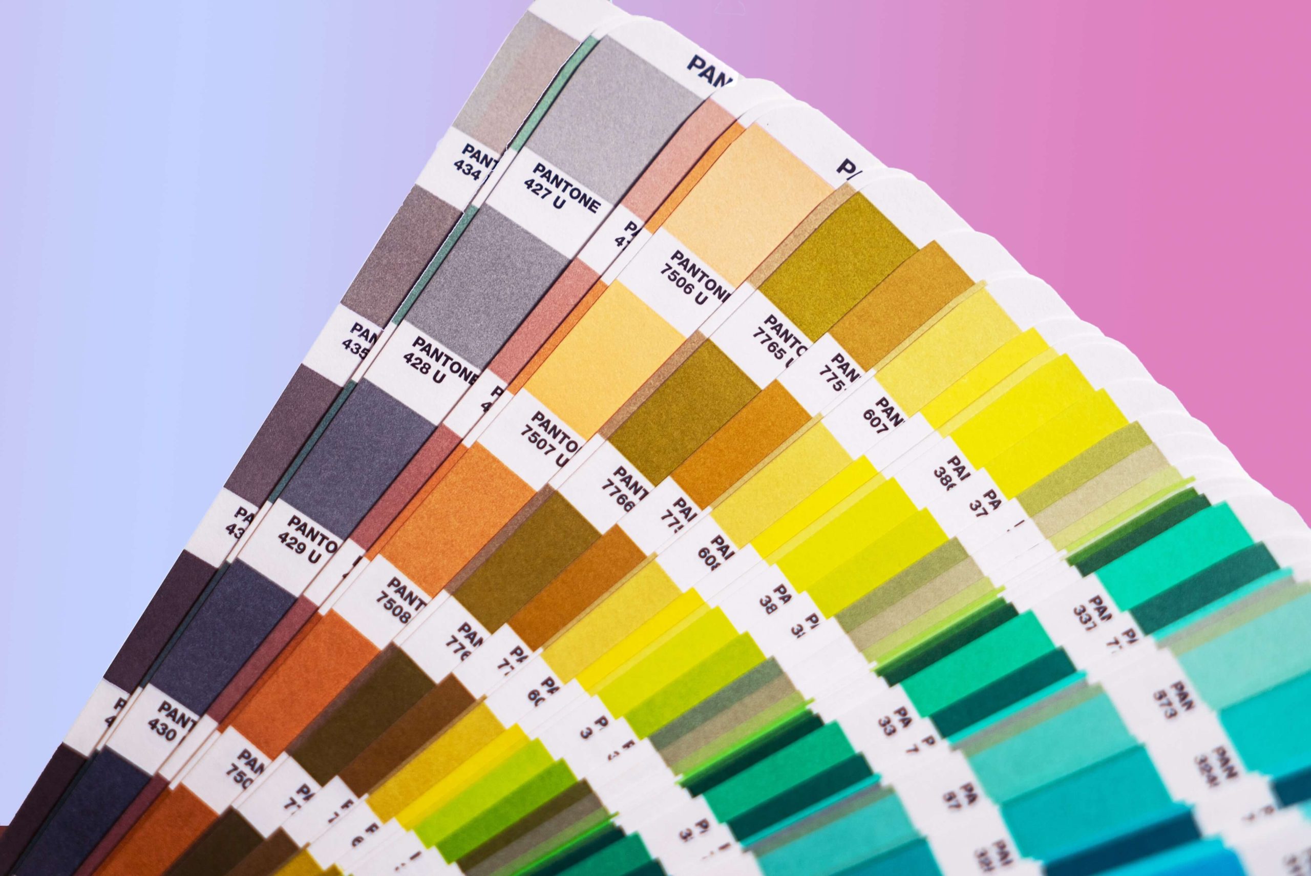
For digital fabric printing, a professional color guide is an invaluable asset. It allows for precise verification of hues before production, eliminating the risk of unexpected results during the printing process.
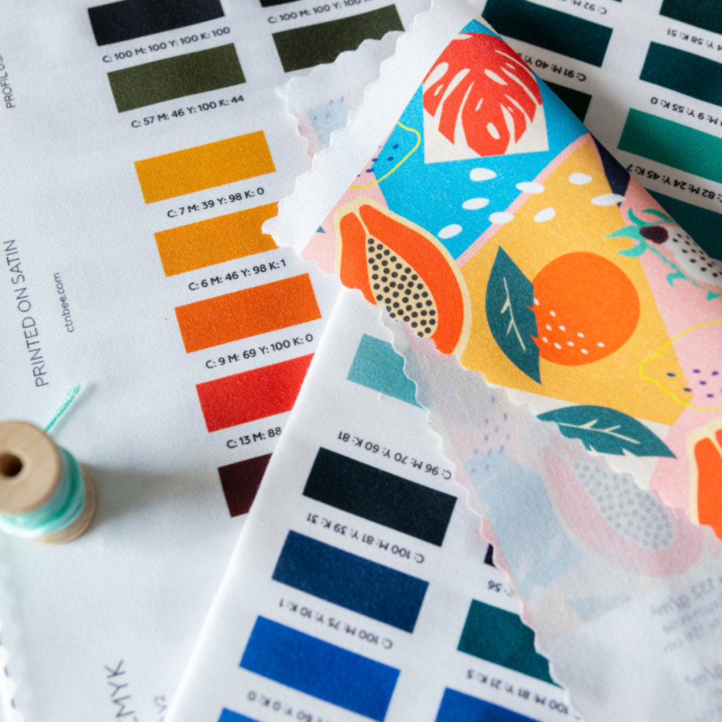
Technical aspects: Screen vs. Print
If you plan to print your designs, you must account for technological limitations. Before starting, learn how to prepare a file for fabric printing to avoid common technical errors.
Always design in the CMYK colour space for print. This ensures your colours maintain their intended character and that the final colour fastness on the finished product meets professional quality standards.
Summary: Colour theory as a tool for success
Consciously applying the principles of colour theory in pattern design is a direct investment in the quality of your work. Understanding tools like the colour wheel allows you to move from amateur experiments to professional pattern creation that builds a cohesive and recognizable brand.
Don’t be afraid to test new colour schemes and bold combinations but always keep the technical constraints of the final printed result in mind. By balancing creativity with technical precision, you ensure that your artistic vision perfectly aligns with the final, physical product.
FAQ – Frequently Asked Questions
The colour wheel is a visual guide that helps designers identify harmonious colour relationships. It is the fundamental tool for ensuring professional choosing colours for patterns and creating balanced visual compositions.
There is no single “best” scheme, but analogous colours are highly effective for creating a sense of flow and calm. For high-impact, commercial designs, complementary colours are often used to draw the eye to specific details.
These are pairs of colours located directly opposite each other on the colour wheel. They provide the strongest visual contrast, making them ideal for dynamic accents and making patterns stand out.
No, because printing is a separate technical process. While colour theory ensures visual harmony, achieving the same result in print requires correct file preparation in CMYK and understanding how specific fabrics absorb ink.