These rules of composition can save your graphic design!
The right colour palette and proper balance between elements in the design are only half the battle. What distinguishes great graphic design from an average project? Composition! The rules of composition will help you build a photo, pattern or illustration that will attract the attention of everyone who just glances at them. Check what rules of composition will help you in designing seamless patterns!

8 rules of composition worth remembering
For a good start, we have collected the rules of composition, which will be very helpful in creating any graphics. When you apply them skillfully in your design, you can be sure that the composition will impress everyone who sees it.
- Find a focal point
- Use the rule of thirds
- Establish a hierarchy and use the scale
- Balance the elements
- Use the contrast
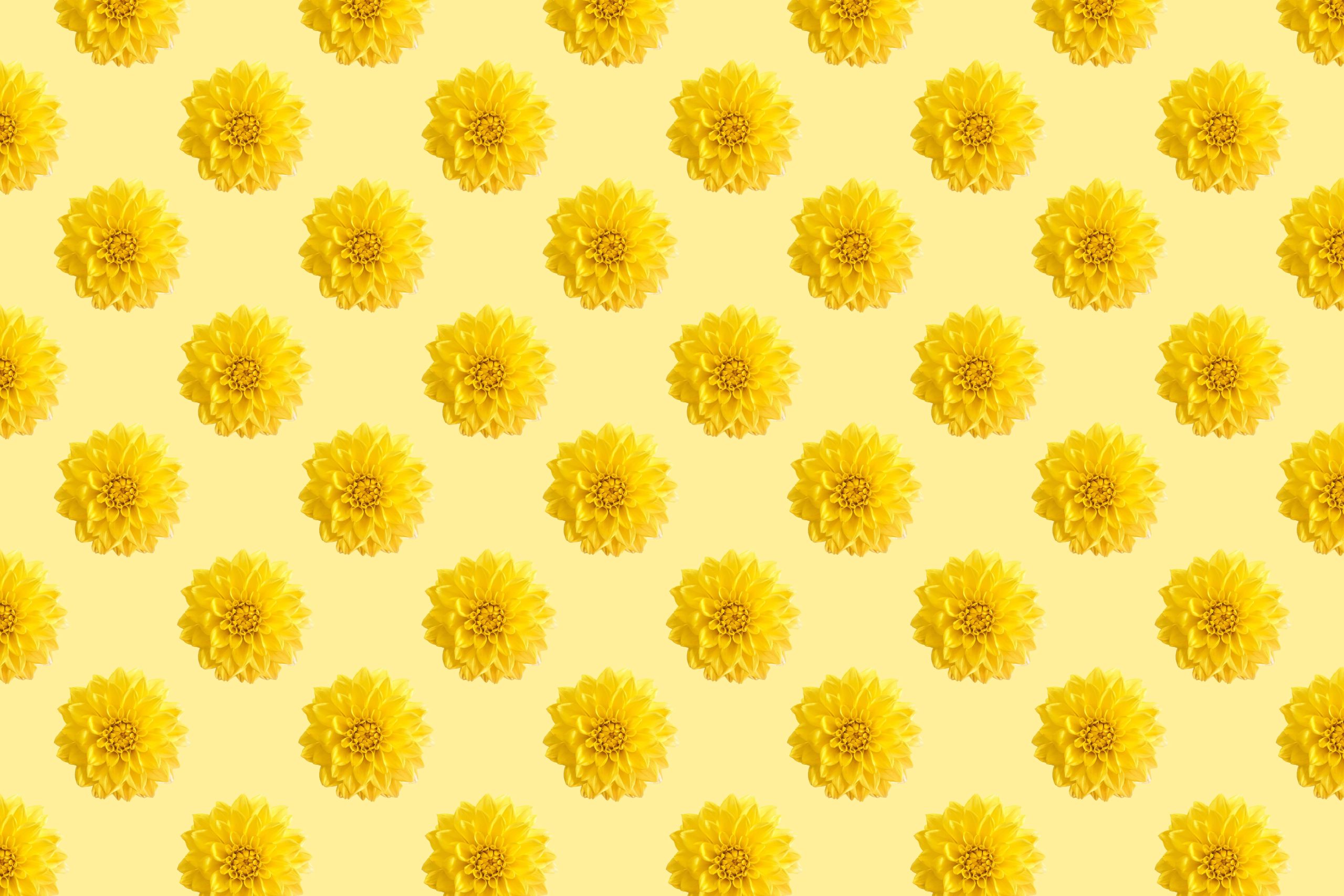
- Repeat items
- Leave negative space
- Use a grid
Find a focal point
Each graphic needs the one element that we pay attention to first. The main point of your composition does not have to be its focal point – the element with the greatest importance can be placed at the edge of your canvas, as long as it stands out enough that the viewer’s eyes will first go to it. To highlight the main point in your composition, you can modify its size, colour or saturation.

Use the rule of thirds
This is the basic principle of composition in photography, but in graphic design, it is just as useful. Graphic design software often has the option of a grid or guides utilizing to the rule of thirds – a grid that divides the image into three equal parts vertically and horizontally. The rule of thirds helps to mark the perfect spots to place the main points of our composition. According to this logic, the main elements should land at the points of intersection of the grid lines. The Fibonacci sequence often referred to as a mathematical recipe for beauty, is related to the rule of thirds. On the basis of the Fibonacci sequence and the golden ratio, we can create a golden rectangle. When we divide the golden rectangle into squares, we can draw a golden spiral inside the figure, i.e. a graphic interpretation of the Fibonacci sequence. The best compositions and works of art are based on the golden spiral, but it can also be seen in nature (for example, in the formation of a hurricane or the arrangement of flower petals.

Establish a hierarchy and use the scale
A good composition cannot lack a hierarchy of elements. It helps to direct the viewer’s eyes toward the most important elements of our project. Of course, this cannot be achieved without the first principle of composition discussed, i.e. the focal point of the design. In graphic design, hierarchy and scale help determine which design element is the most important. The scale and hierarchy rule is typically used in typography, but you can also apply this principle in creating print patterns to bring order to them.

Balance of the elements
Balance among the design elements will create the impression of visual harmony. But how to achieve a balance in the project? Which composition rules can help with this? The concept of equilibrium of composition elements can be compared to equilibrium in the physical world. If we saw the scales in perfect balance, although one of them is weighed with a sack of stones and the other with a single feather, we would immediately recognize that something is wrong. The same is true in the composition and the balance of the elements in your design. Large components feel heavier than their smaller counterparts. The weight of a graphic element in a composition is determined by its colour, size, texture or even shape. You can keep balance among the elements by applying symmetry or asymmetry.
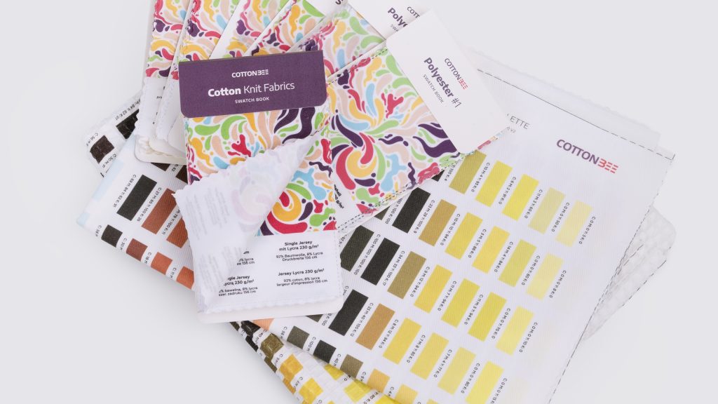
Check this Best Graphic Design Software to Create Seamless Patterns

Use the contrast
By experimenting with the contrast of your design elements, you can make it more appealing or hide parts of it. High contrast will bring the item to the foreground. When you reduce the contrast of an element of your design, you will visually push it to the back. One of the first things that catch our eye in a composition is something that differs. Different shape, colour, texture or different placement of the element causes our eyes to wander to it unconsciously.

Repeat items
Although the contrast works great in the composition, because it makes the design more interesting, the graphics must not lack consistency, which is easily achieved by repeating elements. In a seamless pattern especially, repeating elements will build the structure of the graphic. However, it is important not to overdo the repetitions, otherwise, monotony will reign in the composition. “Repetition makes for successful composition”. Use that rule wisely!
Leave negative space
White space, empty space, negative space – whatever you call it, it cannot be missing in the composition. Negative space is the principle of composition that comes in handy in any design. Skilfully applied makes each design more readable, transparent and balanced. Negative space gives the composition some breathing room which makes it easier to assess what elements are the most important. Don’t fill every space of your canvas – negative space, although sometimes described as empty, is not. It is an integral part of any graphic, it is there for a specific purpose and plays a significant role.

Use a grid
To avoid a situation where your design looks chaotic, arrange the elements in relation to a grid. You can turn on the grid or guides in any graphics program while working on your composition and use it only at this stage. The grid does not have to be part of your design, it is only to help you bring order to your project.

Can the rules of the composition be broken?
We all know, that rules are for breaking. You can break the rules of composition as long as you know what you are doing and what effect you want to achieve. Graphics created against the rules of composition can be a breeze of freshness and present an intriguing artistic concept, but if you break the rules because you simply don’t know them, you will rather achieve mediocre graphics instead of an outstanding composition. Make yourself familiar with all the useful rules of composition, learn to apply them and only then think about breaking them.