Don’t make these mistakes in your repeat pattern
For several hours you’ve been sitting with your eyes fixed on the Photoshop or Procreate interface. You draw, rotate, duplicate, and slowly a repeat pattern emerges on the screen. You look at it, you analyze the elements, but something is wrong. Something is missing, the project is just not right. If this is your experience with designing seamless patterns, be sure to check what mistakes to avoid in surface pattern design.
Table of Contents
- Quick reminder – what is a surface pattern?
- The most common mistakes in designing repeat patterns
- Check before you send the file to be printed
- Save the file in the correct format
Quick reminder – what is a surface pattern?
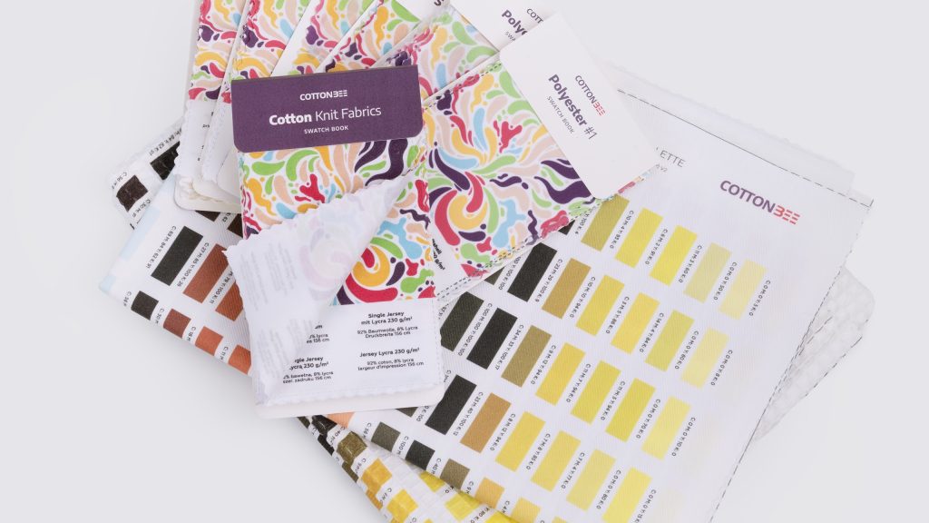
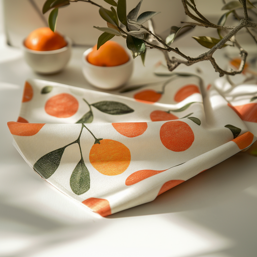
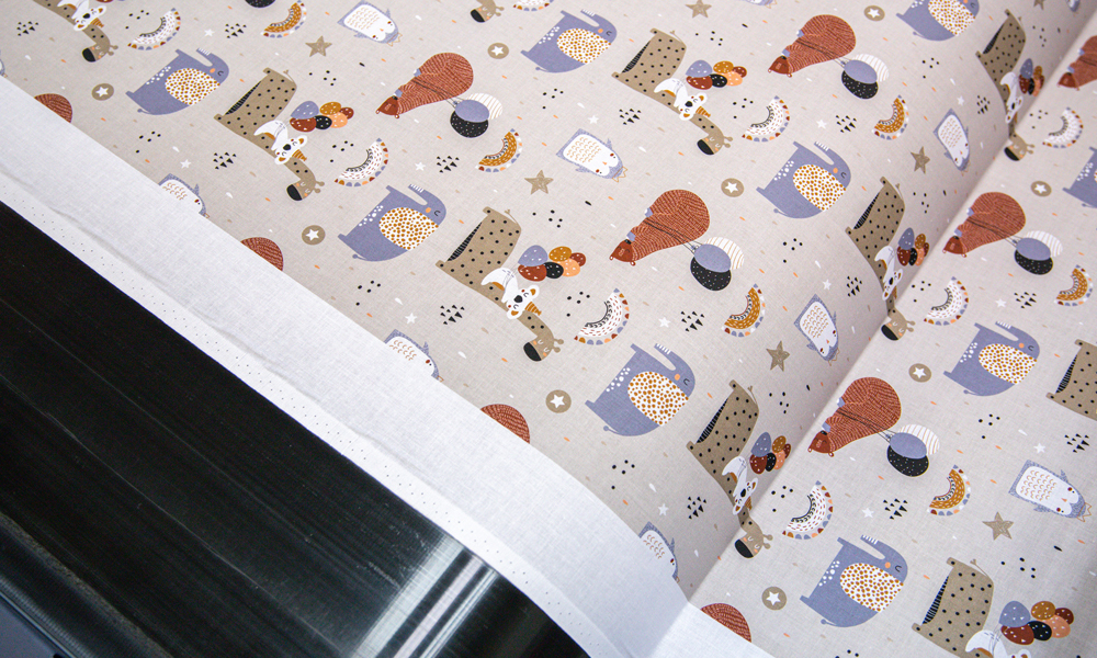
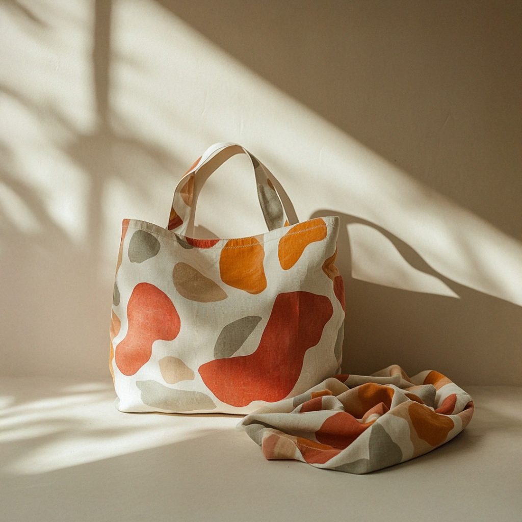
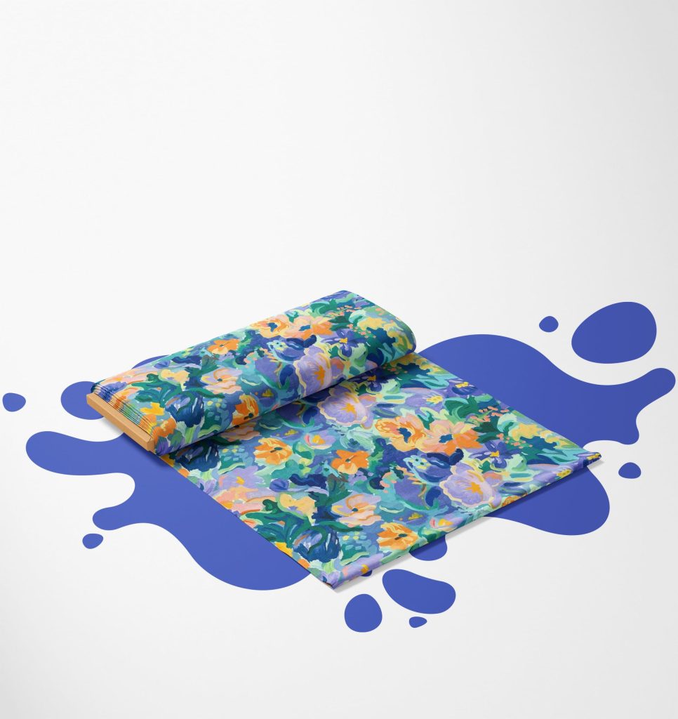
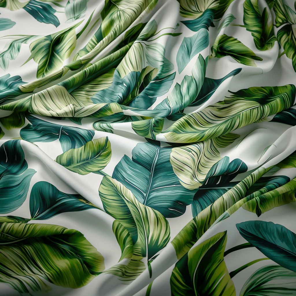
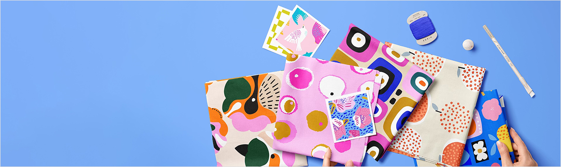
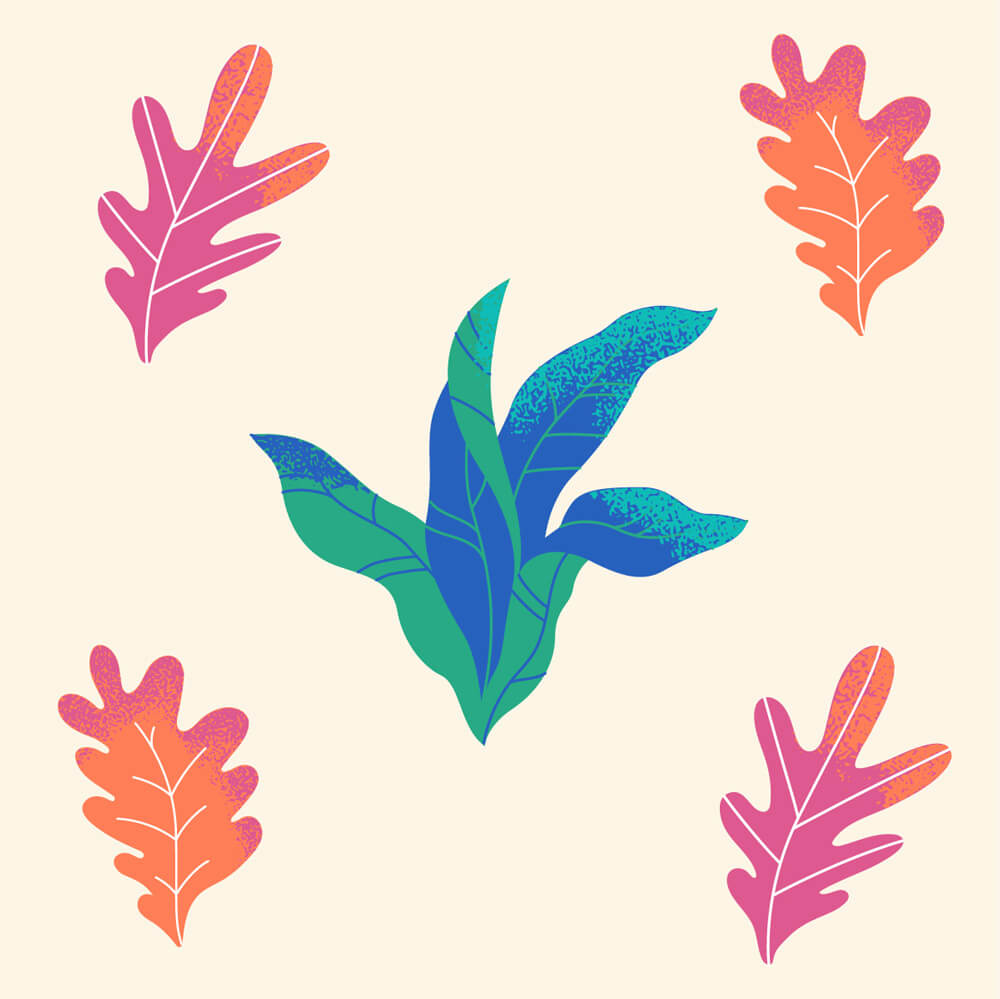
A surface pattern is a graphic designed so that when it is duplicated, the motif joins without clear lines of connection. Seamless patterns are used in printing on a variety of surfaces, including sewing materials. You can print any motif on woven or knit fabric with a properly prepared graphic file. This way you can create personalised interior decorations, clothes and accessories.
How to design a seamless pattern for fabric printing
The most common mistakes in designing repeat patterns
Designing interesting graphics that will additionally combine into a uniform pattern after duplicating the report is a real challenge. Like any graphic design, a repeat pattern must be thought out in terms of composition, colour palette and, above all, it has to be seamless. What mistakes should not be made when designing a repeat pattern? Below is a list of the worst offences.
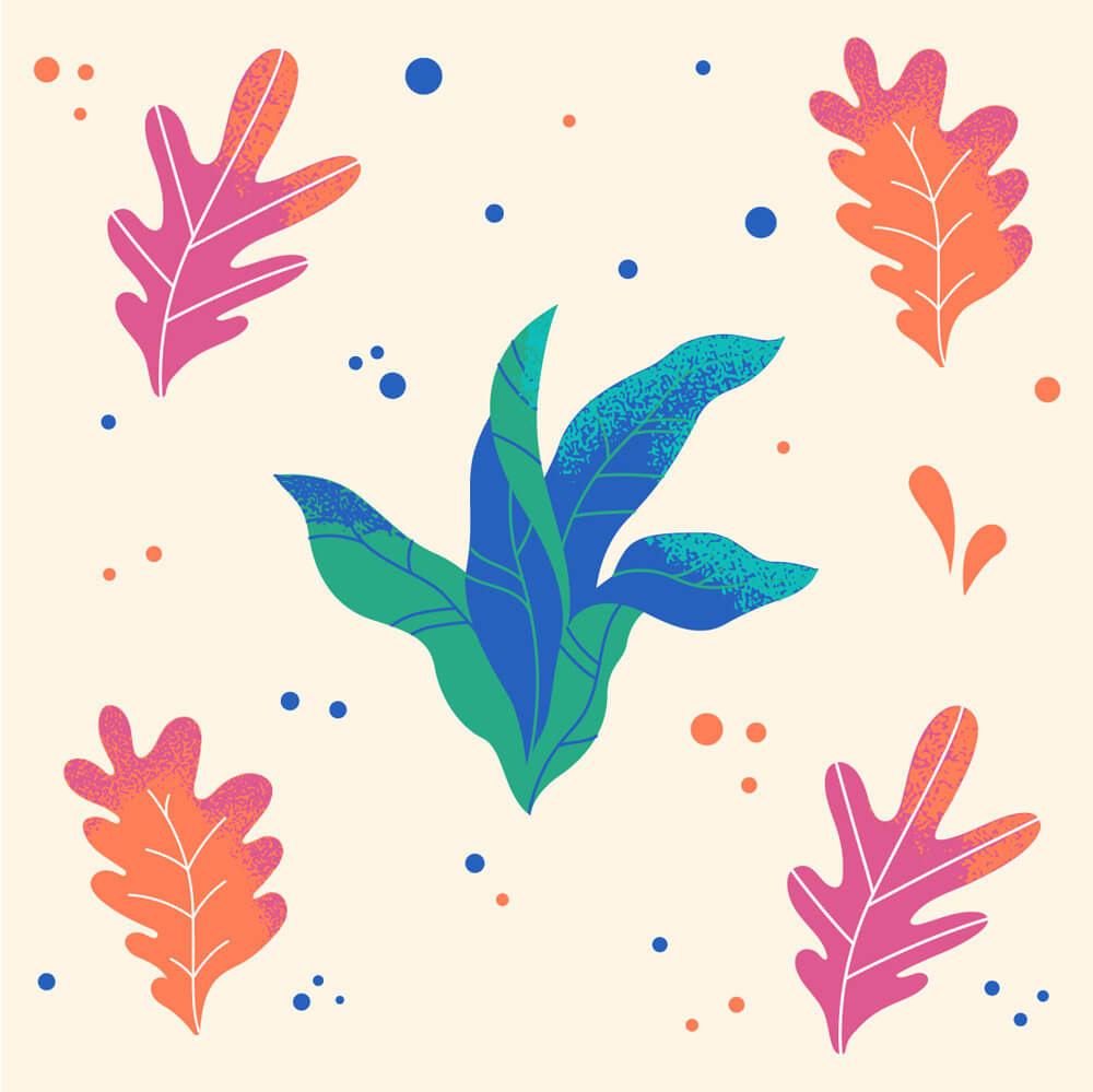
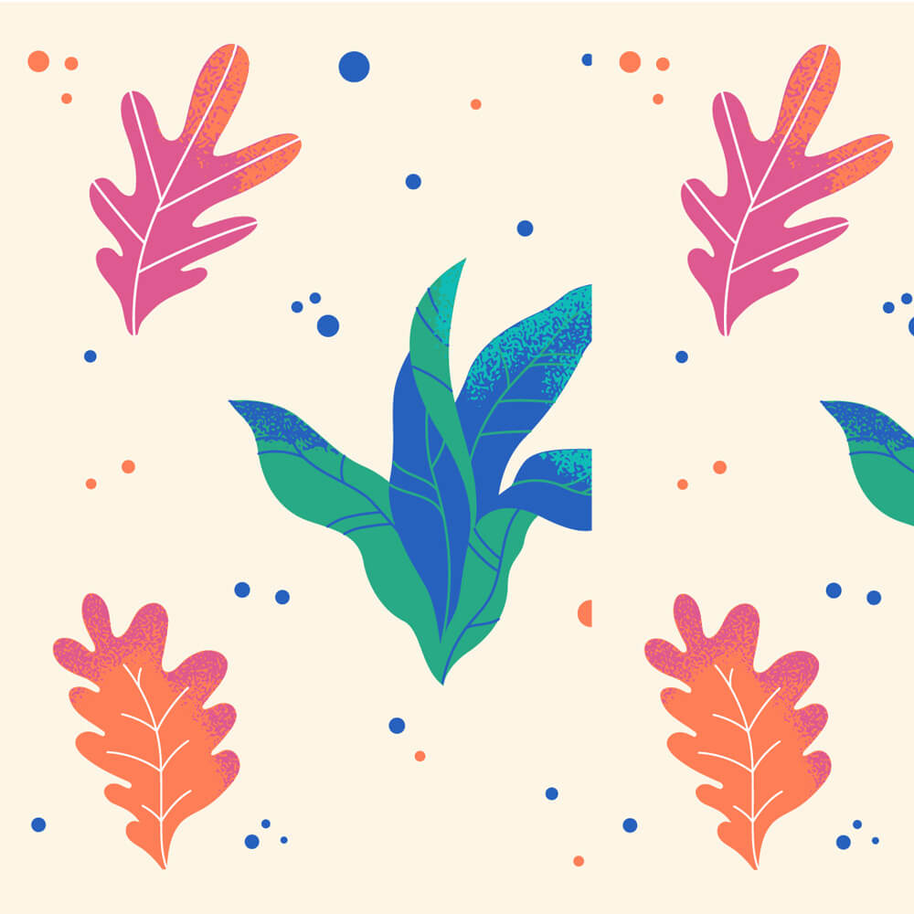
The pattern is not seamless
It should come as no surprise that a seamless pattern that does not duplicate seamlessly is a poorly designed surface pattern. And there can be at least several reasons why the pattern does not join seamlessly. When you design the smallest section of a pattern, i.e. a report, you need to keep an eye on the placement of elements on the canvas from the very beginning. The most important are the elements that go beyond the edge of the working area aka canvas in your graphic design software. The placement of the elements has to be precise, otherwise, they won’t fit and make a repeat pattern. After staring at the screen for hours details can get blurred and it’s easier to miss errors. Take a break, return to the design after a time has passed, and mirror the canvas. This trick makes it easier to spot elements that need to be tweaked or changed so that the composition is consistent.
Too many of the same items
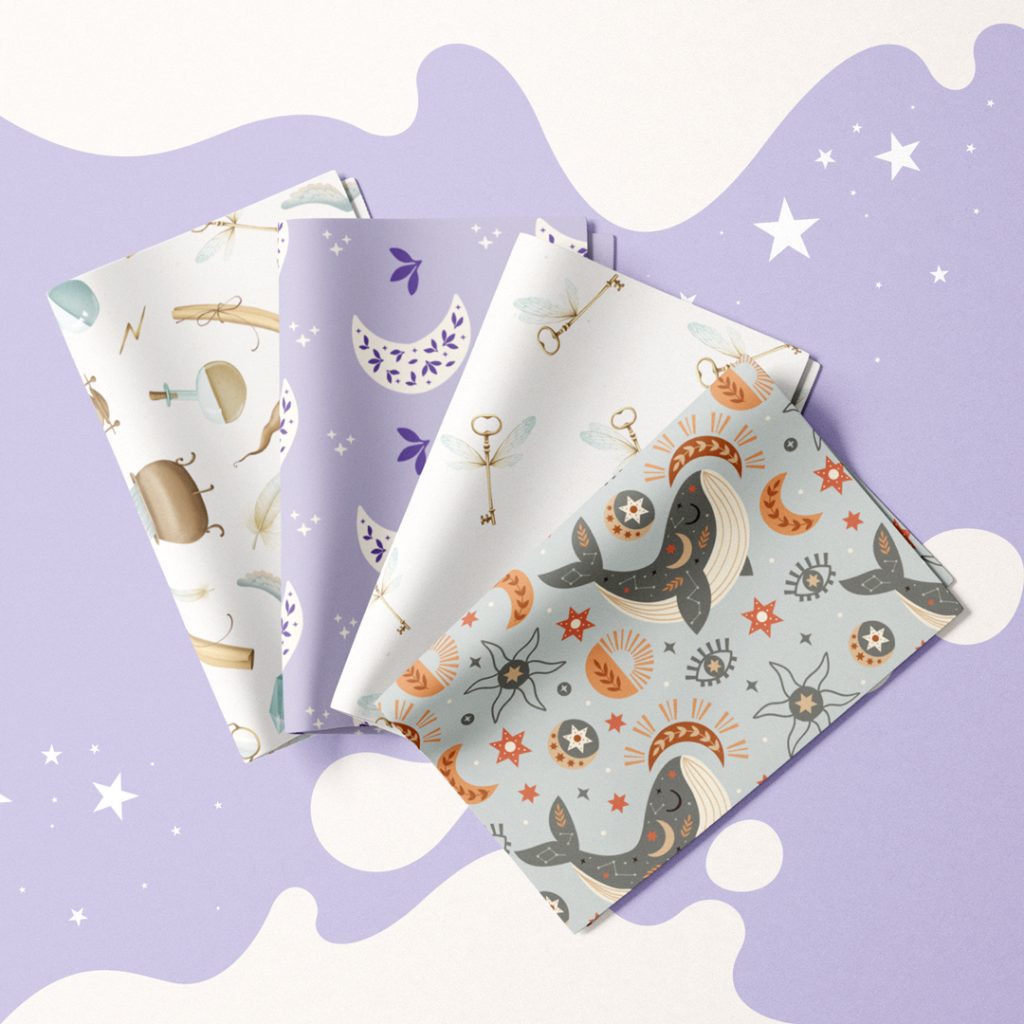
Repeating the same element in a repeat pattern will not always be a mistake. When you create a minimalist composition in which you repeat one element, it will not be a mistake. However, in the case of a more complex pattern, where you want to achieve a balanced image, building this type of composition on one repeating element will result in a monotonous pattern. Change the size and position of elements, and to add even more variety to the design, create a few variations of the main component. Are you creating a floral pattern? Include flowers in a different bloom phase, with a different number of petals or in different colours.
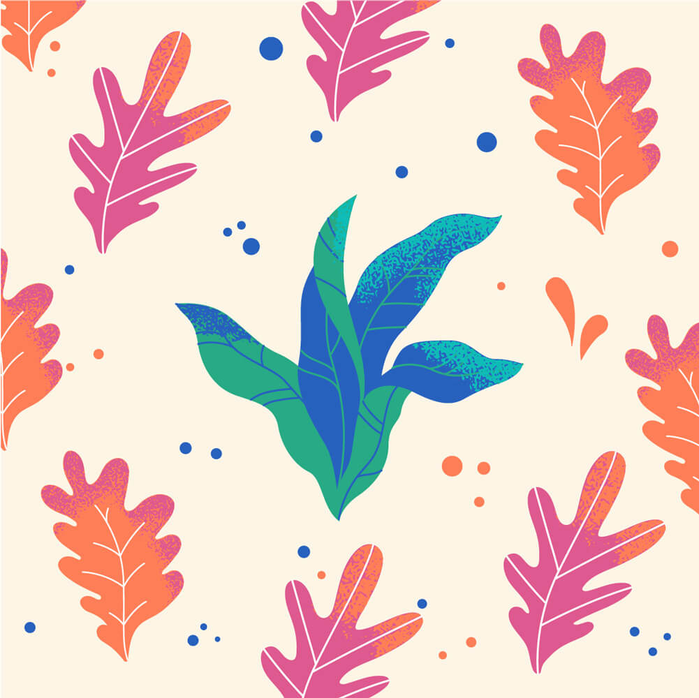
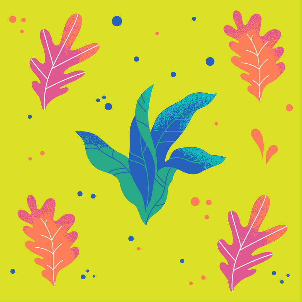
Too much empty space
Empty space is an important element of the entire composition, not solely the seamless pattern. With negative space the project gains some kind of balance, giving the impression of being fully thought out. Too little room will make the graphic elements crowded together as if forced, making the entire composition overwhelming. On the other hand, too much free space can result in a pattern that seems unfinished and empty, as if we abandoned the project halfway through our work on it. You can supplement the empty space between the larger, main elements of the pattern with smaller, decorative elements. Such decorations should also be varied – prepare at least 3 different variations. Dots, stars, small leaves, droplets etc. are perfect to complete the pattern.
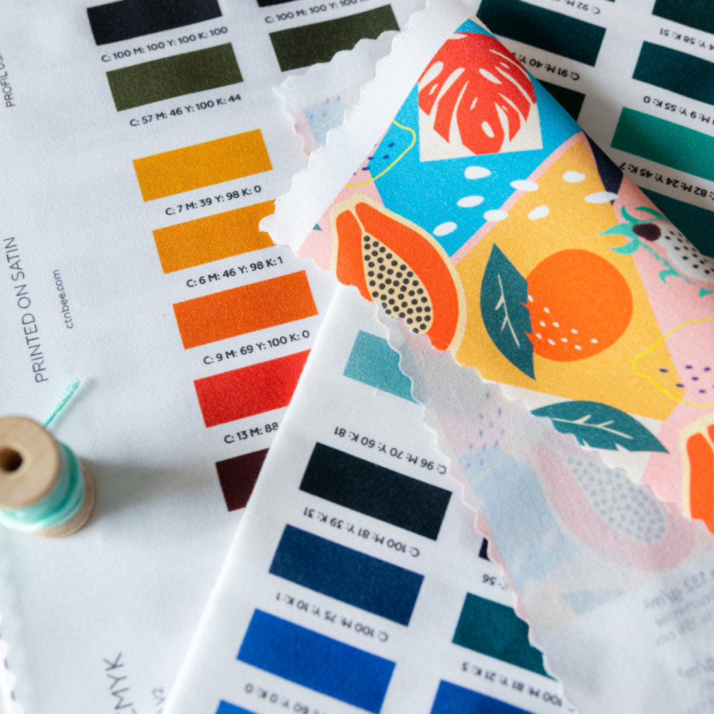
Badly chosen colour palette
Colour is an extremely important element of any graphic design. A well-chosen colour palette will bring life to almost any project. In turn, an ill-considered colour combination will work to the disadvantage of even the most beautiful composition. Colour theory can be very helpful in choosing colour palettes, but even if you’re not too familiar with the principles, you can create a unique and consistent palette. You will find many predefined palettes in various graphics programs, or you can use the tools available online. Are you starting your work with colours in patterns? Choose monochrome palettes that will make each project look consistent.
Check before you send the file to be printed
Before finally exporting the file for printing, check how your design looks duplicated and in different sizes. This way, you can test if the report can be duplicated properly and that the composition will look pretty on fabric or any other surface.
Save the file in the correct format
Save your repeat pattern file for printing in a minimum resolution of 150 dpi, preferably in TIFF format. In the TIFF save options, enable LZW compression, and remember to save flattened graphics without layers – this will greatly reduce the file size.